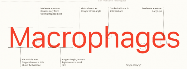
When the Apple Watch was launched, Apple had designed an all-new system font for it called San Francisco. It was meant to be clean-reading, especially for the small face on the Watch. Last week, 9to5Mac reported that San Francisco won’t be limited to the Watch. Apple will also use it as the new typeface for iPads, Macs, and iPhones. It will likely replace Helvetica Neue for parts of OS X 10.11 as well as iOS 9.
One of the main differences about the font that makes it so readable, even on small screens, is that lower-case letters are around 3/4 of the height of upper-case letters. According to a report by Type Detail, it’s similar to Arial and Open Sans. If you’re interesting in having a closer look, head over there and check it out.


